
Back in the day, websites were designed for desktops first. After all, your big old monitor was the gateway to the internet. But today? Your phone is the first screen you touch in the morning, and that’s exactly why mobile-first design isn’t just a nice-to-have anymore. It’s non-negotiable.
Whether you're a startup in Mumbai, a boutique in Goa, or a freelancer in Pune, the people you're trying to reach are scrolling, swiping, and searching, all on their phones. If your website isn’t ready for that, you’re missing out. Let’s break down why mobile-first design matters and how to get it right.
So, What Is Mobile-First Design?
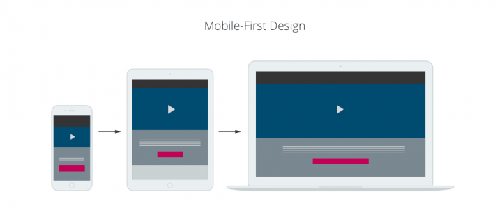
Think of it as designing for the smallest screen first and scaling up. Instead of designing a desktop site and trying to squeeze it down to fit mobile, you start with a clean, focused layout for smartphones and then add enhancements for tablets and desktops. This method ensures better usability, speed, and engagement.
In short, mobile-first design puts your user where they are, on mobile and at the centre of your digital experience.

Why Mobile-First Design Is a Game-Changer
1. It’s What Google Wants
Google uses mobile-first indexing. That means it ranks websites based on their mobile versions first, not desktop. If your mobile site is slow, clunky, or non-existent, your SEO takes a hit. And in the digital race, visibility is everything.
2. India Is a Mobile-First Nation
With affordable data plans and smartphones in every hand, over 70% of web traffic in India comes from mobile devices. Your customers are on the go — your website better be, too.
3. Better User Experience = Better Business
A mobile-first design isn’t just about smaller screens. It’s about intuitive navigation, fast load times, and thumb-friendly layouts. If users can’t quickly find what they’re looking for, they bounce and they bounce fast.
4. Conversion-Friendly by Default
From tap-to-call buttons to simplified checkout flows, mobile-first designs encourage quicker actions. And quicker actions mean better conversions — an enquiry form, a purchase, or a WhatsApp ping.
Getting Mobile-First Right, The Smart Way
Now that we’ve established the ‘why’, here’s the ‘how’, no tech jargon, just solid tips:
1. Keep It Clean and Focused
Less is more. A cluttered homepage on mobile is a recipe for disaster. Prioritise key information. What should your user do here? Make that obvious.
2. Design with Fingers in Mind
Big buttons, easy-to-tap menus, no tiny text. Your design should work perfectly with thumbs, not a mouse.
3. Optimise Images and Speed
Heavy images slow your site down, and nothing kills mobile UX faster than lag. Compress visuals, use modern formats like WebP, and ditch the unnecessary sliders.
4. Test Across Devices
Don’t assume what works on your iPhone will look great on a budget Android device. Test across screen sizes and operating systems to ensure a consistent experience.
5. Use Progressive Enhancement
Start with a basic layout for mobile, and layer on more features as screen sizes increase. It’s not about cutting features; it’s about prioritising the right ones for the right device.
The Bottom Line
In today’s digital landscape, mobile-first isn’t just a design trend; it’s a survival strategy. Whether you're an entrepreneur, a small business, or a growing brand, investing in a mobile-first website is investing in your future
Want to make sure your website’s ready for mobile-first success? Explore our expert Web Design Services in Thane and give your brand the modern, mobile-optimised presence it deserves. We combine creativity, functionality, and strategy to build websites that don’t just look good, they work.
Related Blogs-
https://freshboxmedia.in/blog/website-redesign-the-guide-to-read-before-you-start-your-project/
https://freshboxmedia.in/blog/minimalist-vs-bold-choosing-the-right-look-for-your-website/
https://freshboxmedia.in/blog/custom-vs-template-websites-which-one-to-choose/
 English
 Arabic
 French
 Portuguese
 Deutsch
 Turkish
 Dutch
Dutch
 Italiano
 Russian
 Romaian
 Portuguese (Brazil)
 Greek
Greek